What your team already knows about prioritisation (but hasn’t seen together)
The case for making the invisible visible before you fix anything.
You already know what’s broken. So does everyone on your team.
Ask anyone individually and they’ll tell you: too many priorities running in parallel, work arriving mid-cycle without warning, prioritisation criteria that shift depending on who’s asking. They know. They’ve known for months. Some of them have known for years.
So why hasn’t it been fixed?
Not because people lack awareness. Because each person holds a different version of what’s wrong. Your version is shaped by what you see from your position. Theirs is shaped by what they see from theirs. And without a shared picture, every conversation about priorities starts from a different set of assumptions, a different experience of the problem, and a different theory about what needs to change.
The step most organisations skip is the simplest one: making the current system visible to the people who operate inside it. Not visible to leadership in a deck. Not visible in a retrospective summary. Visible to the room, together, at the same time.
Shared evidence is not a diagnostic step that precedes the real work. It is itself a piece of scaffolding. And without it, everything you build next is weaker, because it rests on twenty different private readings of the problem rather than one shared reading the room agreed was real.
The survey that nobody presented
In a recent cross-functional engagement, spanning brand strategy leads through to operational delivery, the teams completed a short pre-survey. Six to eight calibration questions. Nothing exotic: how manageable is your workload, how do you currently prioritise, what drives decisions in practice, what gets in the way. The findings were clear, consistent, and unsurprising to anyone who had been paying attention individually.
But the results were never presented via decks. Instead, each finding went up on the wall as a poster. The room was given a sheet of dots and one instruction: walk the gallery in silence and place a dot next to anything that matches your experience.
No slides. No narration. No expert standing at the front interpreting the data.
The room went quiet for a few minutes. When people started talking again, the conversation was completely different from the one they had walked in with.
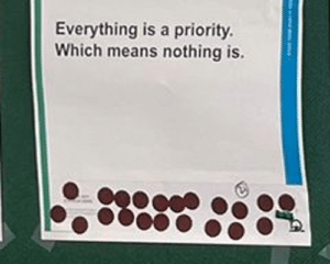
Here is what changed. Before the gallery walk, each person held a private version of the problem. “I feel overwhelmed.” “My team has too much on.” “We get pulled in too many directions.” These are individual experiences, and they stay individual until the room sees the pattern. The moment you discover that the majority of your colleagues also rated urgency as the dominant driver of prioritisation, the conversation shifts. It stops being “I feel overwhelmed” and becomes “we have a system that produces overwhelm.” That is a different sentence. It locates the problem in the system rather than in the person, and it gives the room permission to fix the system rather than cope harder.
The debrief asked four questions: What feels most familiar? What feels most damaging? Where are we compensating for system weakness with personal effort? Which issue, if improved, would unlock the most?
Every one of those questions moves the room from recognition to diagnosis. And because the evidence came from their own survey, the diagnosis belongs to them. Not to an external facilitator. Not to a leadership narrative. To the room.
The prioritisation map nobody expected
The second piece of shared evidence was more physical.
Each table took their real current initiatives, written onto cards from their own planning tools and backlogs, and placed them into a simple flow on the wall: coming in, committed, in progress, blocked or waiting, unclear or floating. For each card they marked who brought it in, whether it was planned or arrived through urgency, whether there was a named owner, and whether it was truly active.
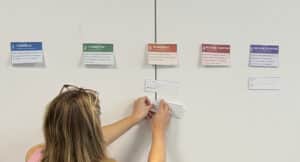
What appeared on the wall surprised the people who built it. Initiatives that had been deprioritised months ago were still consuming effort, because nobody had formally stopped them. Work that entered through urgency sat alongside work that entered through planning, with no visible distinction between the two. Some initiatives had no named owner at all. Others had owners who didn’t know they were owners.
The system’s actual operating rules became visible for the first time. And those rules were different from the ones the organisation believed it was following. The intended flow was strategic priorities into planning cycles into coordinated delivery. The actual flow had a second, parallel intake channel driven entirely by urgency and seniority, and that channel was often stronger than the planned one.
No one needed to be told this. They could see it. The wall told the story.
Why this is the step you cannot skip
It would be easy to treat shared evidence as a warm-up. Context-setting before the “real” work begins. That would be a mistake.
Every prioritisation decision your team makes after this moment either rests on visible facts or invisible assumptions. That is not a small difference. A team that has just seen its own data showing that urgency drives most decisions is ready to build criteria that explicitly address urgency. A room that has just watched its own initiative cards reveal three priorities with no named owner is ready to have the ownership conversation. Without the shared picture, those same conversations produce polite agreement that collapses within a planning cycle, because each person is solving a different version of the problem.
Once the room has seen the same picture, every subsequent conversation references it. Trade-off exercises are more consequential because the initiative cards already showed what is genuinely in flight versus what is drifting without an owner. Conflict conversations are more honest because the survey already named the patterns. Follow-up check-ins have teeth because there is a baseline to measure against.
This is the difference between scaffolding and decoration. Decoration makes a session feel grounded. Scaffolding makes every subsequent decision structurally stronger.
Before you build the protocol, build the picture. Before you ask the room to make trade-offs, show the room what it is trading off against. Before you introduce a new system, make the current system visible.
The room already knows. It just hasn’t seen it together yet.
This is the second in a series on the structures underneath good prioritisation. Previously: Prioritisation is a scaffolding problem. Next: the wall where the real rules live, and what happens when you give a room three minutes of silent writing and a set of category headings.